Which patches still connect.
Land cover and fragmentation metrics for your study area, drawn from high-resolution satellite imagery once a year, so you can rank candidate offset parcels before anyone books an ecologist.
- GSD
- 0.5–2 m(High)
- Cadence
- Annual
- Platform
- High-res satellite
- Spectral
- Multispectral
Choosing offset land by eye
A scheme is losing habitat and you have to find somewhere to make it good. The landowner offers are on your desk. So is the authority's habitat map, an aerial photo layer and whatever the land agent has picked up in conversation.
You open the parcels in GIS one at a time and ask the same questions each time. What is on the ground here? How much of it is a real block and how much is a sliver? Does this parcel sit beside existing habitat, or would it join two blocks that are cut off from each other today?
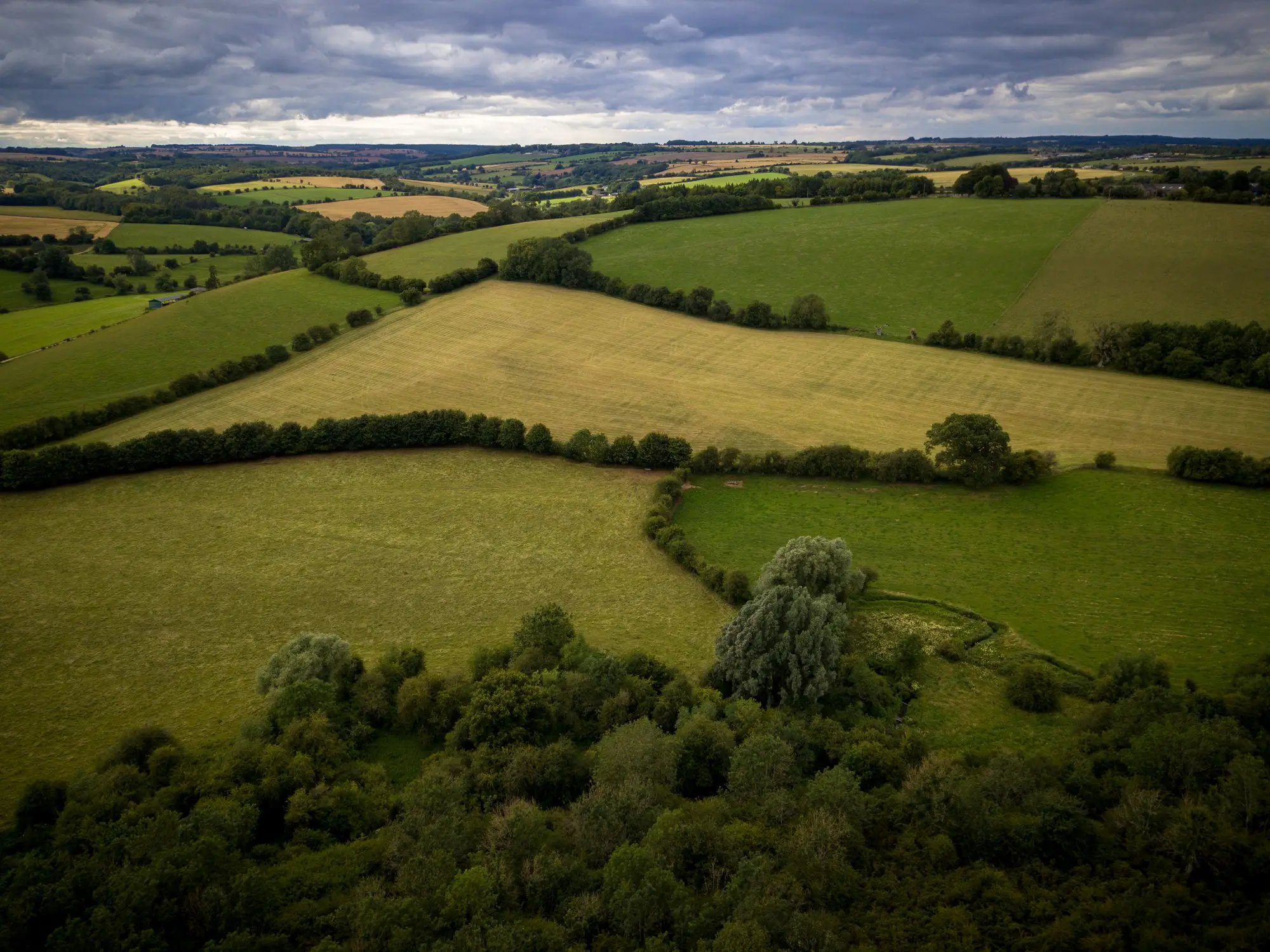
Answering that from the screen is slow and it varies with whoever is looking. The other route is to send an ecologist to each candidate, and the client pays for a walkover before anyone knows the site is any good.
The awkward moment comes at the review, when the client asks why you put parcel C forward and dropped parcel D. If D got ten minutes on a screen, that is a weak answer to give.
Habitat Suitability puts one consistent land cover read and one set of metrics under every parcel in the study area, so the shortlist is ranked on the same basis and the ecologist goes only where it matters.
What comes back for your study area
Delivery is a scoped pilot over the area you draw. It is a desk screening layer for shortlisting and corridor sketching. It does not replace a field survey.
2.1Land cover layer
GeoPackage
Classified land cover for the whole study area, in broad classes such as woodland, grassland, arable, water and built-up. It is one year's pass, taken from the best cloud-free image in the window. Open it in QGIS or ArcGIS beside the parcel boundaries you already hold.
2.2Fragmentation metrics table
CSV
One row per habitat block. Patch size in hectares, edge density, core area and a connectivity measure for each, so you can sort candidate parcels by what they sit next to and what they would link. It loads into a spreadsheet or straight into your own siting analysis.
2.3Corridor sketch
GeoPackage, line layer
Candidate routes between habitat blocks, drawn as least-cost paths across the land cover layer. Use them to compare options against the land you have on offer. They are first-pass options, and you and your ecologist decide which are worth taking further.
2.4Annual repeat
same formats, next year
Run the same area again the following year and you get a like-for-like layer and table, a baseline you can put in a net gain file and compare from one year to the next.
How it works
3.1Draw the study area
You send the boundary as a shapefile or GeoPackage. If the candidate parcels are already drawn, send those too so the table can be cut by parcel.
3.2Imagery is sourced
High-resolution multispectral satellite imagery is picked for the area, using the clearest pass available in the window.
3.3Classification and metrics
The imagery is classified into land cover, habitat blocks are outlined, and patch size, edge density, core area and connectivity are worked out for each block. Corridor candidates come from the same layer.
3.4Hand-over
The land cover layer, the metrics table and the corridor sketch come back, with a short note on the image date and any gaps. Everything opens in the GIS you already run.
Where it fits in your work
Early siting. Rank the parcels on offer before a field ecologist is commissioned, and put the survey money into the ones that survive.
Corridor design. A first read on which blocks could be joined, ahead of a proper design.
Net gain reporting. A repeatable annual baseline to sit beside the ecologist's habitat data in a biodiversity net gain file.
Limits
These are the ways a satellite land cover screen can mislead you.
- Limit 01
Broad classes only
The imagery resolves land cover classes, not individual plant species and not habitat condition. A grassland class does not tell you whether it is species-rich. That is what the ecologist's survey is for.
- Limit 02
The pixel sets a floor
At 0.5–2 m a pixel is between half a metre and two metres on a side. A habitat block needs several pixels across to be found and more to be told from its neighbours, so small patches, narrow hedgerows and thin strips of scrub may be missed, especially toward the coarse end of the range.
- Limit 03
Cloud and season
Each year uses the best cloud-free pass in its window. A very cloudy year may give a poorer image, and late-season or early-season conditions can shift how vegetation classes look.
- Limit 04
Annual, not current
The layer shows the land as it was on the image date. It is not real-time and it will not show a field ploughed last month.
- Limit 05
A screening layer
Treat it as one input among several. A legal offset determination sits with the regulator and the ecologist.
Who it's for
- Mitigation and offset planners at land development consultancies who have to shortlist compensation land.
- Teams sketching corridor options for a scheme and wanting a consistent first read before commissioning survey work.
- Consultancies that want an annual habitat baseline they can repeat and file.
Who it's not for
- Teams that need a field ecology survey, a species record or a condition assessment.
- Teams looking for an offset to be approved or signed off. This does not do that.
- Real-time or week-by-week monitoring of habitat change.
- Habitat mapping of very small or narrow features, such as a single hedgerow.
Questions from planners and their ecologists
Does this replace a field ecology survey?
No. It is a desk screen to narrow the list. The survey still decides what is actually on the ground.
Which land cover classes does it resolve?
Broad classes such as woodland, grassland, arable, water and built-up. The exact class list is set when the pilot is scoped. It does not identify species.
How current is it?
It is an annual layer from the best cloud-free pass in the window. It is not real-time.
Does cloud cover affect it?
Yes. The delivery uses the clearest pass available, and the note says which image date the layer shows.
Can we check it against our own habitat data?
Yes. Send the ecologist's habitat polygons for a few sites and set them beside the layer. Tell us which sites hold your ground truth when the study area is scoped and they can be compared in the delivery note.
Can it prove biodiversity net gain on its own?
No. It gives a repeatable baseline of land cover and connectivity that sits beside the statutory metric and the ecologist's survey. It does not produce metric units.
What formats does it come in, and how does it fit our GIS?
The land cover layer and corridor sketch come as GeoPackage, the metrics as CSV. All of it opens in QGIS or ArcGIS.
Who owns what we get back?
Use and ownership terms are written into the contract before the pilot starts. Any licence terms on the source imagery are set out at scoping.
How is a pilot priced?
Each pilot is scoped and quoted on its own. You get a written scope that can go through your own approval.
Send us a study area and we'll say what a pilot would cover.
Or .